Tag Archive for: HR data visualization

Happy Holidays from orginio

Happy holidays from your orginio team!

It’s that time of the year again and as we are taking a look back on the past months we hope that orginio was of great use to you in 2018 when creating your org charts!

Maybe our cloud solution helped you share details on the org hierarchy with your colleagues? Did you integrate it into your company’s intranet portal? Or, were you able to visualize additional relations such as succession within the org chart via dotted line?

Whatever the scenario, in order to keep working with orginio easy and straightforward, we’ve published some articles this year in the orginio blog that target various possible application scenarios.
In addition, you’ll find some helpful videos on our Examples page as well as articles to cool features on the Favorite Features page. You should have a look 😉

New design for greater user experience

To further optimize the orginio user experience, we introduced a design update this year. It’s modern and fresh, and allows you to present more information in the org chart, e.g. additional details of a selected object.

Thanks to new display rules, objects can now either be blanked out or highlighted via color coding. If you haven’t tried these rules out, you should. This way, it’s so much easier to focus on the information relevant to you!

But before you dive back into org charting with orginio, we would like to wish you happy holidays and a healthy, prosperous new year!

Let there be more smart org charts in 2019! 🙂

Visualizing organizational relationships in your org chart

Ingentis HR gimmicks


By Kelly O’Hara


Relationships within an organization are neither simple nor one-way. Therefore, it’s not enough to display a standard hierarchical structure when trying to point out the deeper connection of co-workers. As mentioned in an earlier article about organizational visualizations, illustrating relationships that are cross-departmental, project-based, or otherwise outside of an employee’s regular reporting structure helps HR and managers see all areas of the organization that an employee touches. So let’s have a look at different visualization possibilities in this next Ingentis HR gimmick.

Why visualize relations

Structures and relationships in organizations aren’t always black and white. For example, an employee can directly report to one team or manager but also work closely with another team. Or, there is a special connection between two colleagues that may not have too much impact on the everyday work life but is generally of great importance, e.g. a mentorship. This is why it’s very helpful to use different visualizations to highlight specific connections.

Solid and dotted lines

The most common way to do this is by implementing solid and dotted line structures.
The solid line is also known as legal line and typically represents the reporting structure concerning for example vacation requests, everyday workflows and legal processes. Dotted lines on the other hand can be a bit more nuanced and are implemented differently amongst companies. Here are some examples:

Mentors

At first sight, it may not seem necessary to include a mentorship on an org chart, but they can be helpful for oversight especially during employee onboarding. If your company has a formal mentor program for new employees, it can help to keep track of who is working with whom, or show if there are enough mentors for all the new employees.

Successors

To assume that your org chart is set in stone and that no one will move away from the company or change roles only hurts you in the long run. Org charts are constantly changing due to joiners and leavers, promotions, or role changes. One way to stay on top of these changes and make transitions easier for your organization and teams is to implement a successor program.
Not every role needs an official successor documented, but high- to mid-level managerial positions can benefit from having a successor in place. Successors can be visualized on an org chart through the use of dotted lines. This allows both HR and upper management to track a successor’s relationship with their current and future role and make sure that processes are in place for future success.

Deputies

Another reason to work with dotted lines is to point out one’s deputy. Let’s say, you’re planning on going on a sabbatical. Your colleagues will need to know who to get in touch with once you’re out of office. Implementing dotted lines in your org chart is a quick and easy way for them to find the answer. No need for the time-consuming questioning of several co-workers in vain – it’s all there, in your organogram.

Network visualizations

One valuable structure to document is that of agile networks, such as project teams. These networks are typically temporary and comprised of employees from multiple departments. For example, a product launch would require employees from product, engineering, and marketing to work together closely. A customized relation, illustrated as what we call a network visualization, could connect all team members, including the project team lead.
To avoid confusion, this network visualization would not be part of the default org chart but an additional view.
As a result, the default org chart would provide an overview of the legal structure while the network visualization shows how many project teams there are and who is part of them.

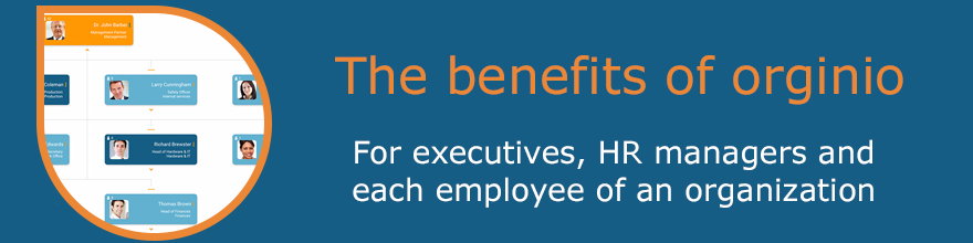
Both our org charting solutions Ingentis org.manager and orginio offer the possibility of highlighting relationships via dotted line. In addition, Ingentis org.manager enables network visualizations. To find out more about the software, visit:

Ingentis org.manager 
orginio

Organizational visualizations with org charts

Ingentis HR gimmicks

By Kelly O’Hara

We as humans are inherently visual. About 83% of what humans perceive is based on sight1 with the other 17% broken down among the other senses. As a logical consequence, we believe that the visualization of HR data (or any data in general) is an essential tool for identifying the information that is important to you when sifting through the data jungle! So, let’s explore some different ways you can create visual representations – with your org chart!

Hierarchy Structures

One of the most obvious visualizations for org charts is the hierarchy structure. Being able to see an entire organization from top to bottom in a visual way makes it easy for anyone viewing the chart to understand relationships and reporting structures quickly. An org chart can show details like pictures of employees, team structures within groups, and other data, or it can be a simple hierarchy tree that allows for viewers to easily drill down into departments and command structures.

KPIs

Integrating KPIs directly into your org chart gives HR and managers quick access to important information about teams and departments, facilitating the process of HR controlling. For example, if your organization is looking to grow a department’s head count by the end of the year, showing the head count KPI right on the chart makes it easier to see how close you are to reaching your goal at a glance rather than drilling down into the department and manually counting the roles. Or, how about visualizing each department’s budget spent to see at a glance if they are still on track?
Check this page to see some more examples of how the visualization of KPIs looks like with Ingentis org.manager: https://www.ingentis.com/orgmanager/orgchartsoftware/controlling/

Big Data

The visualization of big data can be incredibly beneficial. Rather than working with spreadsheets and documents full of numbers and text, creating a visual representation of your organization’s data can make it easier and faster for consumption of the information at a glance. Employee demographics such as gender or age, location and head count are just a handful of data sets that can be visually represented.

A thought to keep in mind: The larger your organization, the more data you most likely have available. However, just because you have data available doesn’t mean you need to visualize all of it! Focus on making your complex or extensive data visual. If a visualization of the data doesn’t help in time-to-comprehension, it probably isn’t necessary.

Relationships

Relationships on an org chart can be different from a standard hierarchical structure. Visualizing relationships that are cross-departmental, project-based, or otherwise outside of an employee’s regular reporting structure helps HR and managers see all areas of the organization that an employee touches. For instance, you can create separate groups for these relationships (e.g., project or agile teams which we’ll go further into below) or show the relationship through dotted lines. Read more about the visualization of organizational relationships in this Ingentis HR gimmick.

Special Skills

Special skills can often be overlooked as an important part of org charts. Adding skills to your organogram can help HR or managers quickly find employees who fit certain descriptions or have a non-role-related skill without having to send out to company-wide communications asking for the information.
Keep track of who on your staff is certified for first aid, what additional languages anyone speaks, or what degrees people hold. And what about fun information for culture like who enjoys playing soccer? The options for what you record are endless. A great option to visualize this kind of information easily is with the help of icons. Another way of quickly finding employees with special skills is by incorporating the search function. This example called “Who plays soccer” shows how it works in our cloud solution orginio: https://orginio.com/examples/

Agile Teams

Since agile teams are dynamic-based on which roles are needed for projects at a certain time, visualizing how they fit into your organization can be incredibly beneficial. There are a few ways you can visualize your agile team within your overall org chart. For example, try color coding employees who are part of a team, creating completely separate groups for the agile team. Or giving iconographic indicators to these employees so that when you look at the organization as a whole, you can delineate which employees are currently working on an agile project.
We recently wrote a blog post about how you can visualize agile team structures which you can check out to dive even deeper into the topic.

To learn more about ways to visualize your org charts with Ingentis, have a look at our org charting tools:

1.See for example Florack, Scarabis, Primosch (2012, p. 325), or Braem (2004, p.192). 
orginio: Cloud based org charting

The benefits of orginio for executives, HR managers and each employee of an organization

Org charts by orginio are versatile HR tools that each employee of an organization can benefit from.

Executives

The whole team at a glance, thanks to orginio. The overview orginio provides to executives is clear and rich in content – and it’s available anytime and anywhere.
Need to draw some information about a team member or contact them? Or, would you like to have a closer look into resources? It’s all possible in your orginio org chart.

Access protection allows you to limit the availability of confidential data to certain people.

HR managers

With orginio, the creation of org charts is easy to handle. If the necessary data is already saved in an Excel file, all you have to do is upload it to orginio! Of course, you can start from scratch and develop your hierarchy structure step-by-step. Additional information about an employee (e.g. skills) can be added at any time.

Dotted lines show relationships between employees, e.g. mentor- or deputyships, or successors.

Org chart branding is also possible with orginio: Give your org chart the right look by adjusting it to your corporate design or selecting one of the designs already available with the application.

Changes to a company’s structure can happen anytime. Reorganize your org chart within seconds via drag & drop.

Executives and HR managers

The visualization of important KPIs turns org charts into a powerful strategic tool for executives and HR managers. Be it head count, span of control or other key figures – it takes just the push of a button to display them within the org chart.

Each employee of an organization

orginio provides everybody with a clear, reliable overview of the company hierarchy, including contact information. The integrated search functionality helps when looking for further data.
Especially new colleagues profit from the possibility of retrieving information about other team members, their contact details and responsibilities.
The org charts are printable and exportable.

Are you interested in learning more about orginio? Check out the org charting tool’s most favorite features here.